Your menu isn't just a list of dishes — it's one of the most powerful sales tools your restaurant owns. Where a dish sits, what words describe it, and how the price is written all directly shape what a guest decides to order. This influence isn't accidental — it's backed by a field called menu engineering, refined and tested for decades.
The good news is you don't need to redesign your entire menu to apply these principles. Small changes — swapping a word, moving a dish to a different spot, formatting a price differently — can noticeably lift your average check.
In this guide, we'll walk through the core principles of menu psychology, the tactics backed by real data, and how a digital QR code menu takes these principles even further than a printed one ever could.
What Is Menu Psychology?
Menu psychology is the practice of using design, pricing, and language to subtly guide what a guest chooses to order. It isn't about tricking anyone — it's about understanding how people naturally scan and read a menu, then presenting information in a way that feels clear and appealing rather than random or cluttered.
Industry research shows that well-applied menu psychology can lift average check size by up to 15%, without raising a single price. Individual tactics can move the needle even further — descriptive language alone has been shown to boost sales of a specific dish by as much as 27%.
This isn't a passing trend. It's a systematic approach that's been used in the restaurant industry for decades, backed by academic research — including well-known pricing studies out of Cornell University.
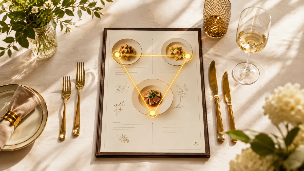
The "Golden Triangle": Where Do Eyes Land First?
Eye-tracking studies have revealed a consistent pattern: people don't scan a menu randomly. Most eyes land on the center first, then move to the upper-right corner, and finally to the upper-left corner. Menu engineers call these three spots the "Golden Triangle."
The practical takeaway is simple: place your highest-margin dishes in these three zones. The bottom of the menu, or the most crowded section, gets the least attention — that's a more logical spot for low-margin, low-choice items like standard side dishes.
The Menu Engineering Matrix: What Stays, What Goes?
The classic menu engineering framework scores every dish on two axes: popularity (how often it's ordered) and profitability (the margin it leaves behind). That places every item into one of four categories.
| Category | Profile | What to Do |
|---|---|---|
| Stars | High popularity + high profitability | Highlight in the Golden Triangle, leave unchanged |
| Plowhorses | High popularity + low profitability | Revisit pricing or reduce ingredient cost |
| Puzzles | Low popularity + high profitability | Rename, improve the description, reposition on the menu |
| Dogs | Low popularity + low profitability | Consider removing from the menu |
This analysis typically draws on 60-90 days of sales data — tracking how often each dish is ordered and what margin it leaves. Digital menu systems collect this data automatically; a paper menu requires tracking it by hand.
Pricing Psychology
Drop the Currency Symbol
Research shows that a dollar sign next to a price subtly reminds the guest they're about to spend money. Removing it (writing "20" instead of "$20") can lift average check by up to 12%, since the number reads less like a payment and more like a simple label.
Avoid Right-Aligned Price Columns
Classic printed menus that line up prices in a right-aligned column, often connected by dotted lines, make it easy for guests to scan straight down and pick the cheapest option — because visual comparison becomes effortless. Keeping the price inline with the dish description, as part of the normal text flow, weakens that comparison reflex.
Use the "Anchor" Effect
Placing one expensive item on the menu — even one that isn't your highest-margin dish — makes everything else look like better value by comparison. Guests judge prices relatively, not absolutely; a pricey "anchor" dish makes a slightly cheaper, high-margin item feel like the smart choice.
The Power of Word Choice: Descriptive Language
There's a real sales difference between writing "chicken" and writing "herb-marinated golden chicken breast with a hint of lemon zest." Sensory, specific descriptions bring the dish to life in the guest's imagination and make them more likely to choose it.
Note: Figures are based on international industry research (Supy, Owner.com).
A practical tip: add at least one sensory detail (texture, aroma, taste) or an origin story (local, house-made, traditional) to each dish description. Something as simple as swapping "fries" for "crispy, sea-salted fries" can make a real difference.
Visual Design Rules
Avoid the Paradox of Choice
There's a well-documented psychological effect called the paradox of choice — when guests are given too many options, they struggle to decide, and either order nothing or default to something familiar, which is often lower-margin. Experts recommend capping each menu section at 5-7 items.
Photos Are Context-Dependent
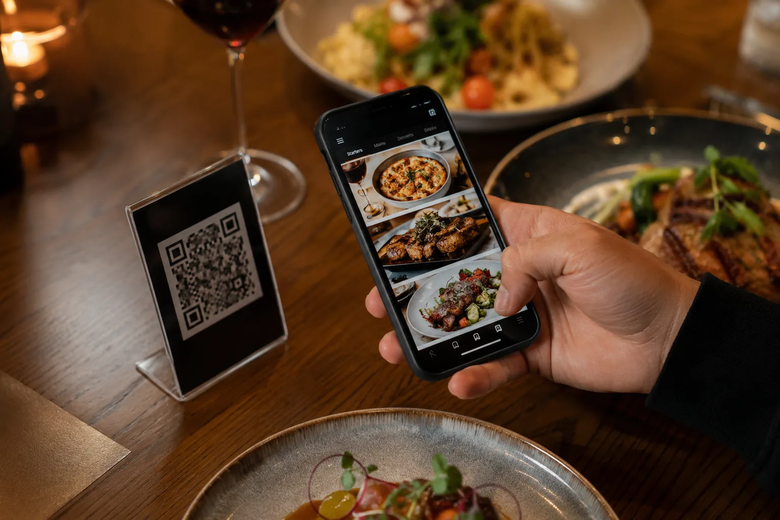
Here's an interesting nuance: research shows that photos on a printed fine-dining menu can sometimes create a "cheap, mass-produced" impression. But that rule flips entirely for digital menus — for guests ordering online or through a QR code, photos meaningfully boost sales, since the guest can't see the dish in person and relies more heavily on visual cues.
How a Digital Menu Takes These Principles Further
Applying these principles to a paper menu is slow — every change means a new design and a new print run. If you haven't made the switch yet, setting up a QR code menu takes the entire process to a different level.
Freedom to Test and Measure
You can rename a dish, rewrite its description, or move it to a new spot and see the results within days — with zero printing cost. That turns "test, measure, improve" into a cycle that's simply not possible with a paper menu.
AI-Powered Personalized Suggestions
A static Golden Triangle looks the same for every guest. QRMenuNow's AI Upsell feature, on the other hand, offers a personalized suggestion to each individual guest — automatically recommending items that pair with whatever's already in their cart, creating a personalized "Golden Triangle" effect that a fixed layout simply can't replicate. This typically lifts order value by 15-25%.
Decisions Backed by Real Data
Calculating a menu engineering matrix by hand can take weeks. A digital system's analytics dashboard shows you, in real time, which dishes are "Stars" and which are "Dogs" — turning a weeks-long process into a decision you can make in minutes.
Common Mistakes to Avoid
- ✓Offering too many choices — keep each section to 5-7 items at most
- ✓Giving every dish the same visual weight — if nothing is highlighted, nothing stands out
- ✓Leaving the menu unchanged for years — a seasonal or annual review is worth the effort
- ✓Right-aligning prices in a column — this reinforces the price-comparison reflex
- ✓Making decisions without sales data — your personal favorite dish isn't always your most profitable one
Frequently Asked Questions
Does menu psychology work for every type of restaurant?
Yes, the principles are universal, but the application varies by concept. Bars can use a high-margin signature cocktail as an anchor, while fast-casual spots often benefit most from a simplified, shorter menu.
How often should I update my menu?
Small changes like pricing or descriptions can be reviewed quarterly, while a full design refresh is generally recommended once a year. With a digital menu, since there's no printing cost, you can update as often as you like.
Are photos always a good idea on a menu?
No, it depends on context. On a fine-dining printed menu, too many photos can create a "cheap" impression. For online ordering and QR code menus, though, photos almost always boost sales, since the guest can't see the dish in person beforehand.
How do I calculate a menu engineering matrix?
Track each dish's order count and margin over a 60-90 day period, then compare each item against your averages to sort it into one of four categories (Star, Plowhorse, Puzzle, Dog). Digital menu systems automate this calculation for you.
Conclusion
Your menu isn't a passive document — used well, it's an active tool that drives sales. From the Golden Triangle to word choice, each of these principles creates a small but measurable impact.
You don't need a new print run every time you want to apply these principles — test your menu with QRMenuNow, track the results on your analytics dashboard, and let the AI Upsell feature deliver a personalized "Golden Triangle" to every single guest. A well-designed menu and a steady stream of Google reviews work together to bring more guests through the door. Request a free demo.